Feature
Shipment Entry: Wizard to Single Page
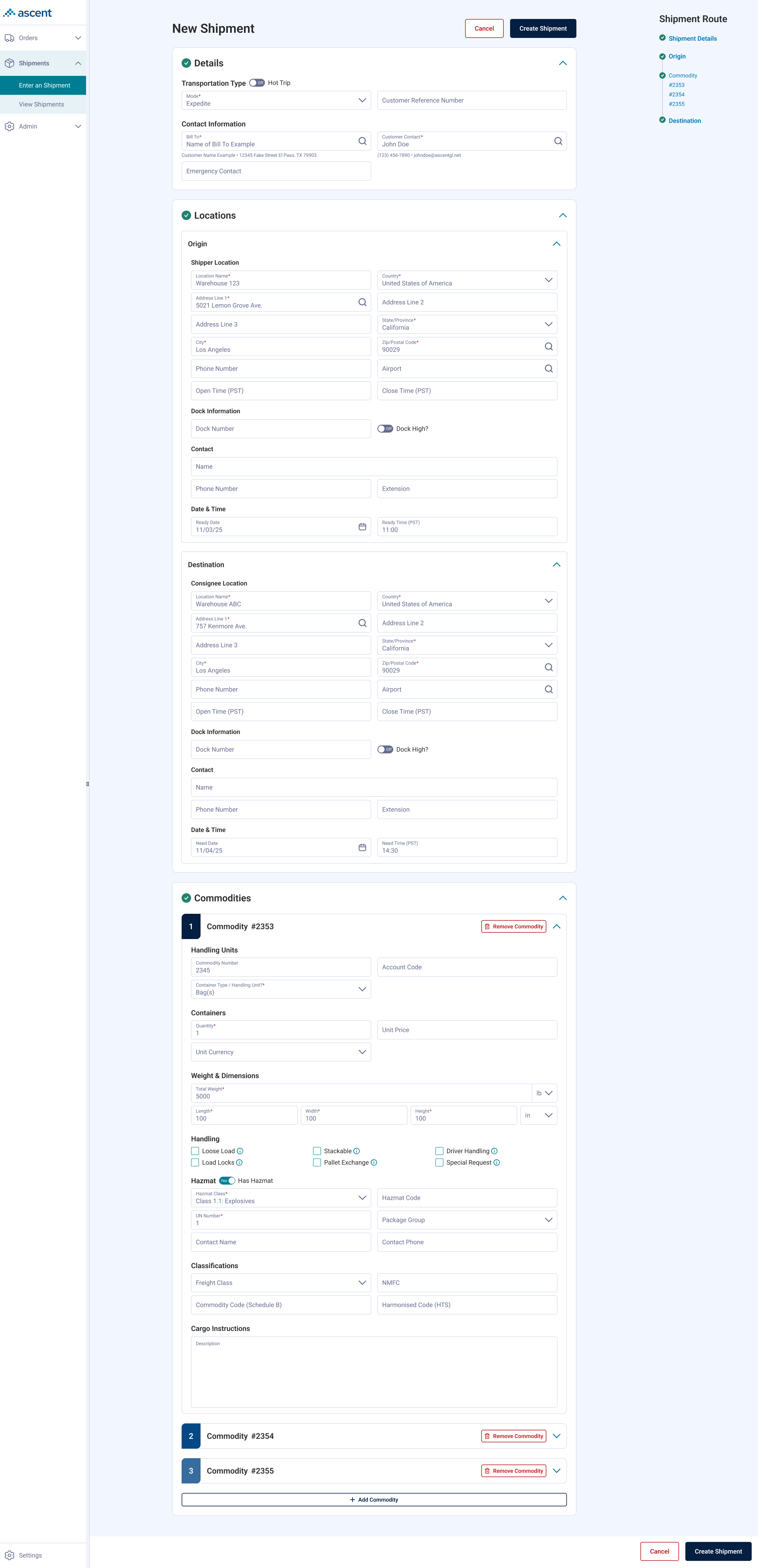
A single-page entry flow that preserved the wizard's field contingency logic, and a collapsible container structure now reused across the system.
A single-page entry flow that preserved the wizard's field contingency logic, and a collapsible container structure now reused across the system.
Ascent leverages technology to improve the logistics process.

Bulk shipment entry was slowed by a multi-step wizard requiring screens per shipment.

A single-page flow that preserved the wizard's logic in a reusable collapsible pattern.

Product Designer

1 PM, 1 BA, 4 Full Stack Dev, 1 QA.

Retained the wizard's validated logic while designing the single-page structure and its reusable pattern.
Our operation team members, the primary user for this feature, create shipments for our customer users using our product. These shipment orders define what and how their cargo will make it from its origin to its destination. This is a task they perform every day, usually multiple times a day. This feature has existed for many years under different names across Ascent's product line.
The team decided that our newest product iteration needed to move away from the wizard workflow toward a single page, in order to better support bulk orders (operations users completing multiple shipments in one sitting). I was brought onto the project to lead that redesign.
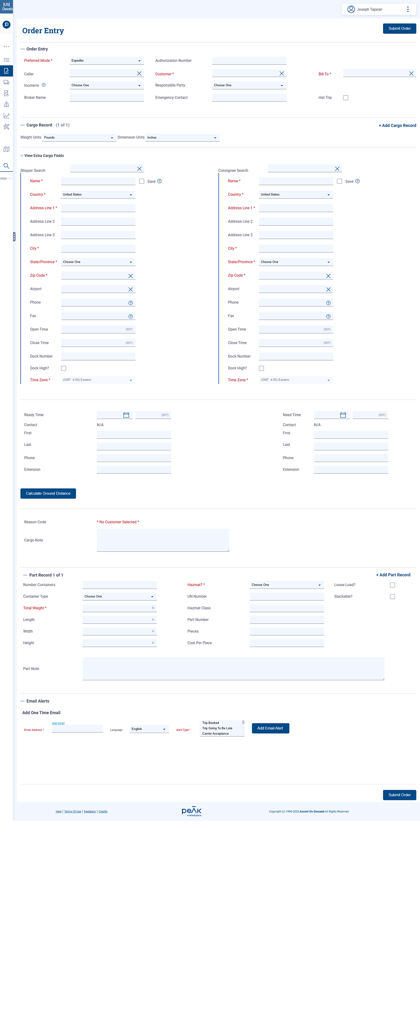
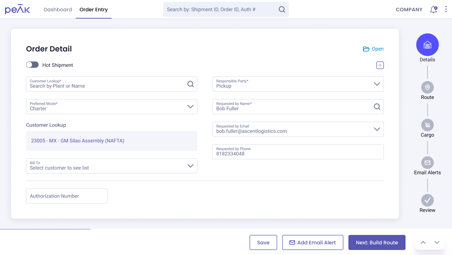
Operations users complete this form multiple times a day, often for bulk orders in a single sitting. The team believed a single continuous page would be faster to complete than stepping through a multistep wizard, particularly for repeat, high volume entry.
This tradeoff wasn't new. The original single page pattern this feature was based on had itself been replaced by a wizard in an earlier product iteration. The latter was in direct response to user feedback that the form required too much training to complete because of its length. As the team built the newest product, that same tradeoff resurfaced from the other direction. Speed for bulk, repeat entry became the priority.
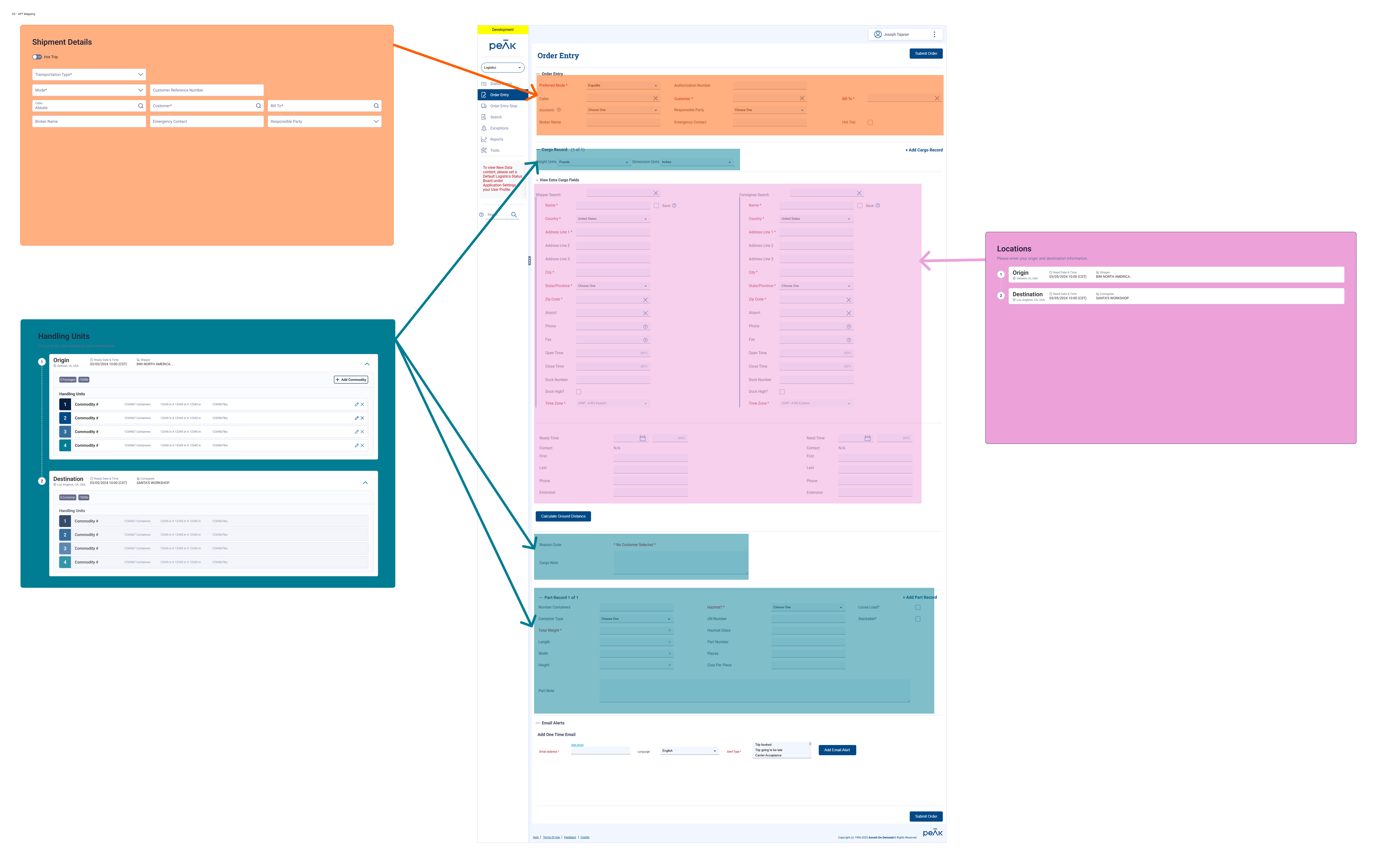
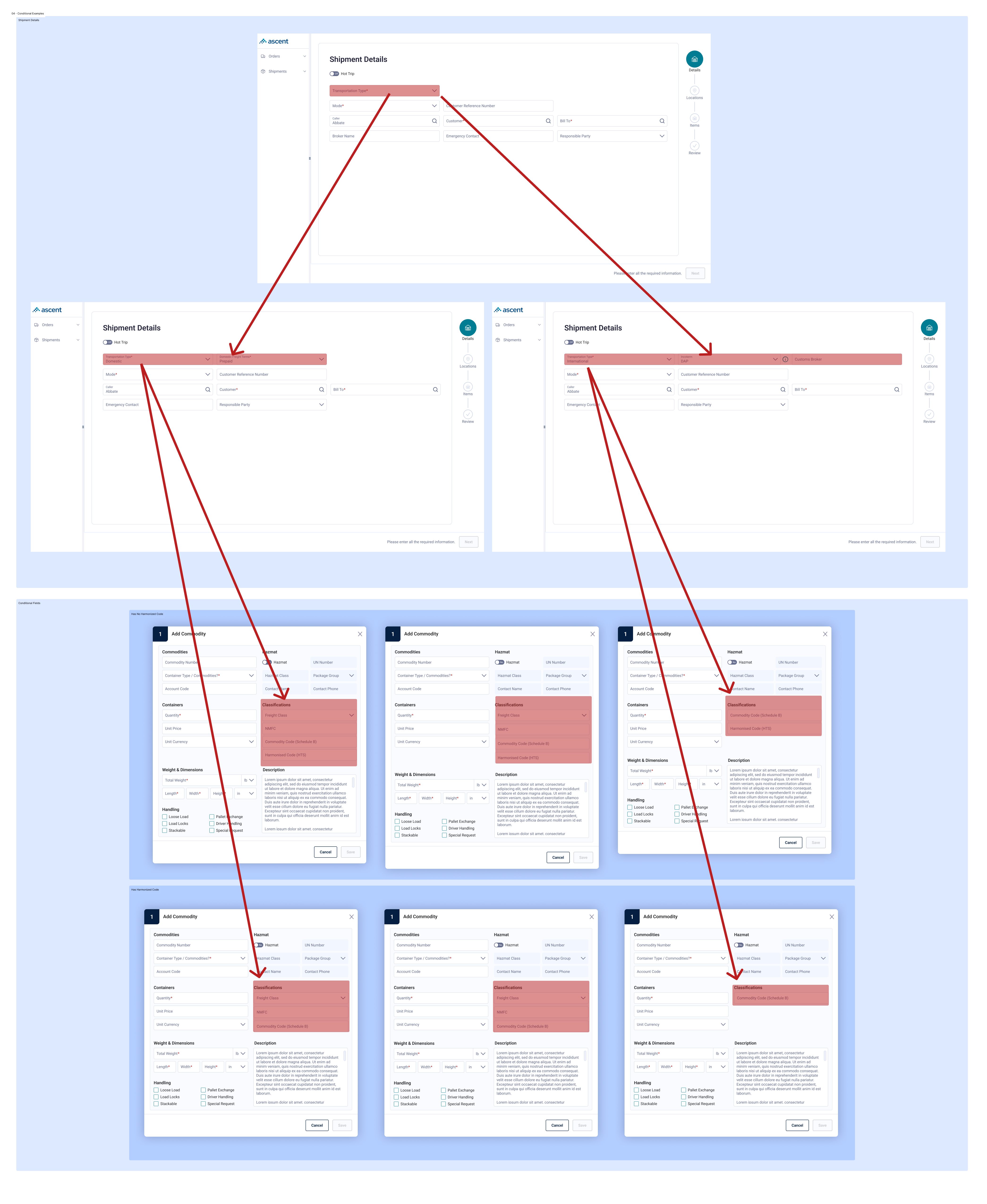
While I didn't design the wizard version of this feature, I did facilitate the research for it and advocated to keep it. Outside of reducing cognitive load by partitioning it into multiple screens, there were many contingencies where if a user selected one input on one screen, it could affect their selection in another.
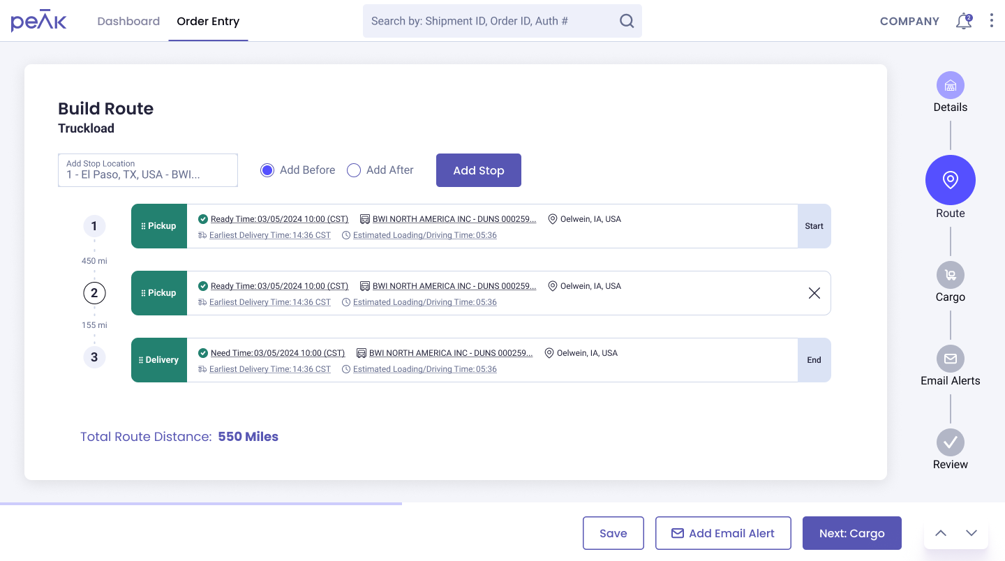
Additionally, there was a level of complexity that we solved for in the previous product that we were purposely reducing for this scope, but knew we had to scale to it eventually (e.g. going from an origin to destination to multiple origin or destinations or multi-stop).
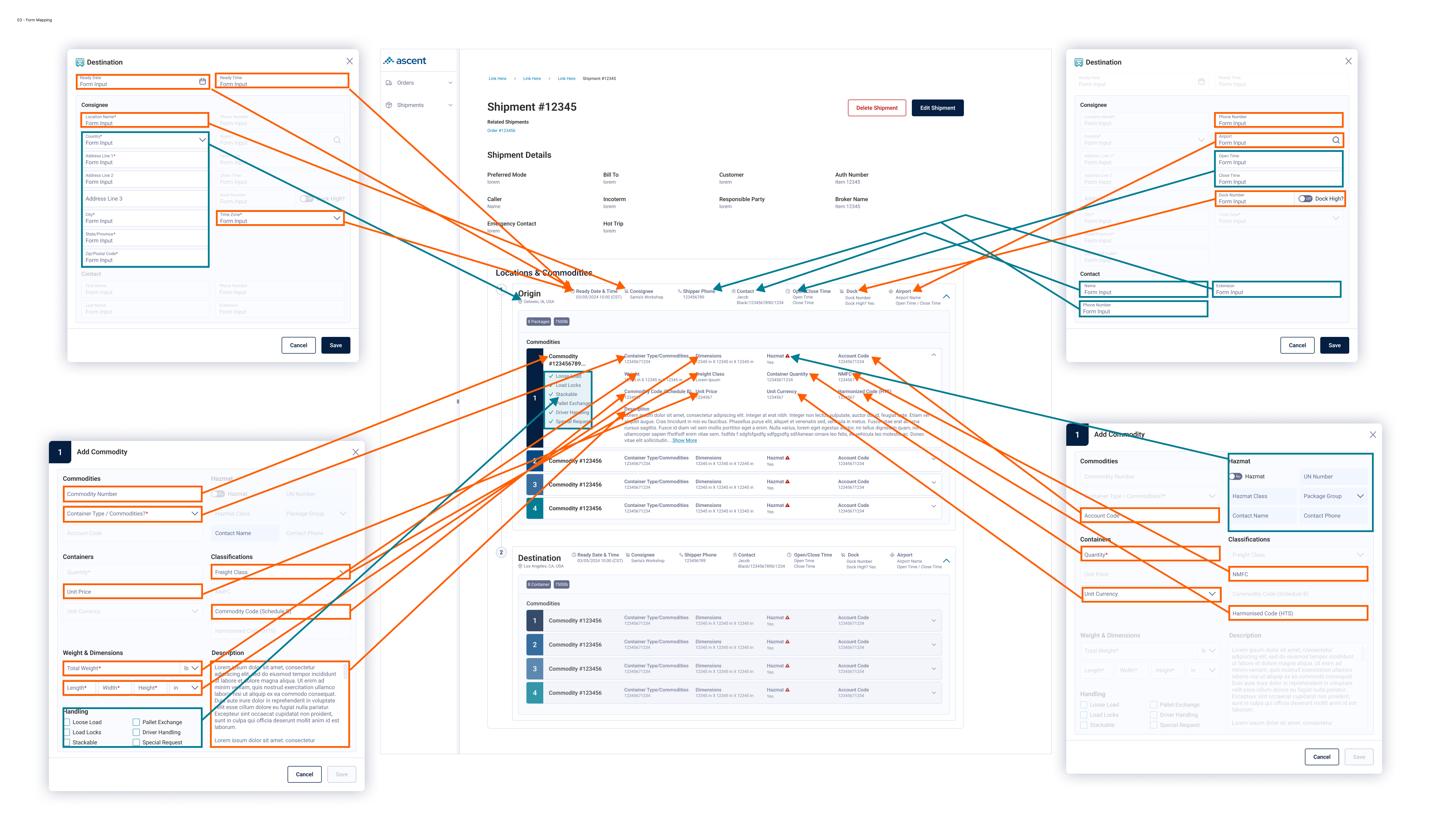
Ultimately, the team determined that the trade off for speed, especially since our first users will likely be operations anyways, was worth it. So I began mapping out what we were going to port over in the new product.
Using our original single page design as a reference, one of the challenges I wanted to resolve immediately was reducing cognitive load, which was resolved in our previous iteration. We could reduce the height of the page by filling in all white space and using the smaller variant of our form fields, but this would for certain make it more challenging for a user to scan, read, and complete.
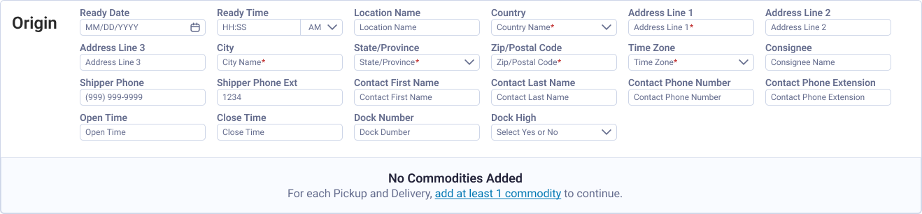
Using modals would reduce vertical height since we are compartmentalizing interactions to when users would perform them, intentionally interrupting the flow. This would be helpful for sections like the add commodity section where it would be one-to-many items. This would achieve the goal of having a shorter page and making the interaction of adding a new value item intentional. The team preferred a workflow where users tabbed through a section, which was a reflection of how our users actually use the system, so we abandoned the modal idea.
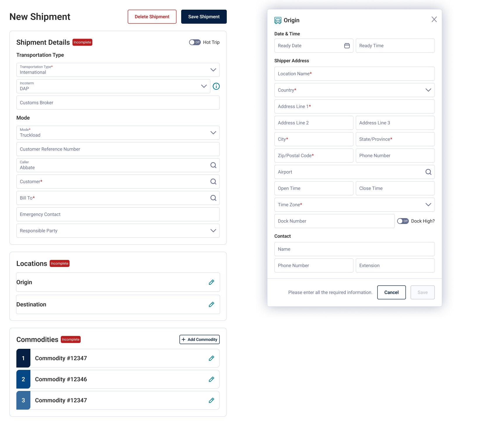
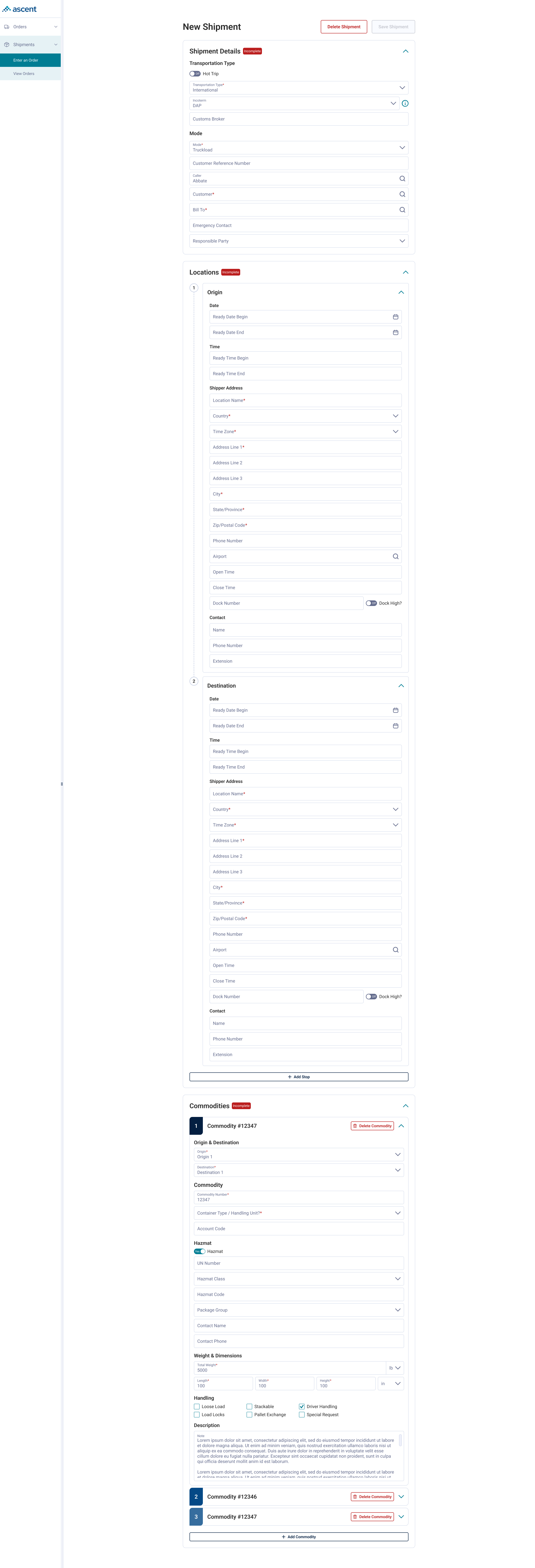
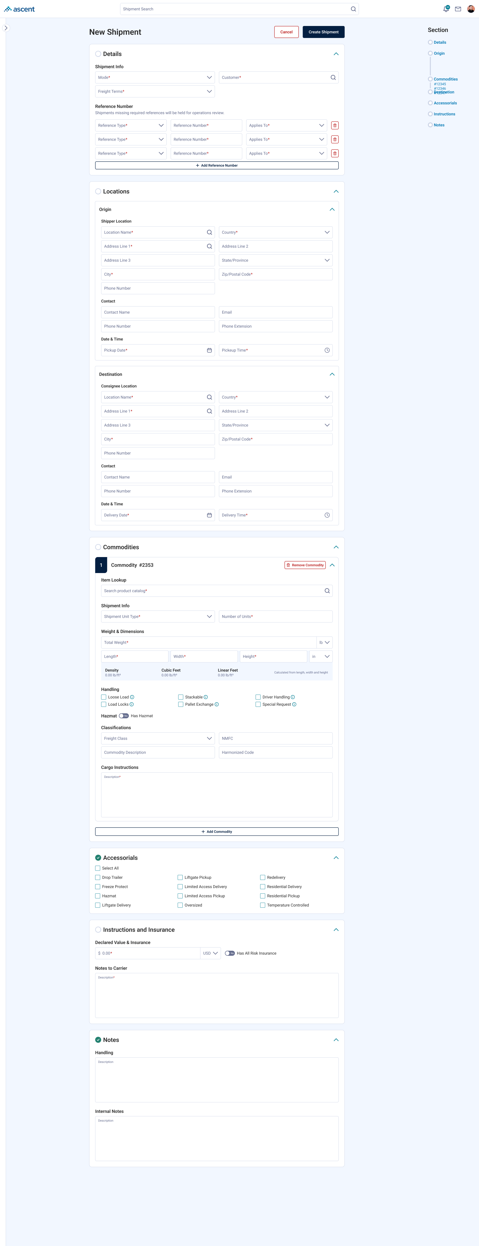
Ultimately, I leaned into chunking via collapsible containers. The system would default to one container first then the others would open as the user completes all relevant required fields. This would circumvent the load of seeing it all at once and have them focus on one section at a time, similar chunking pattern to a wizard.
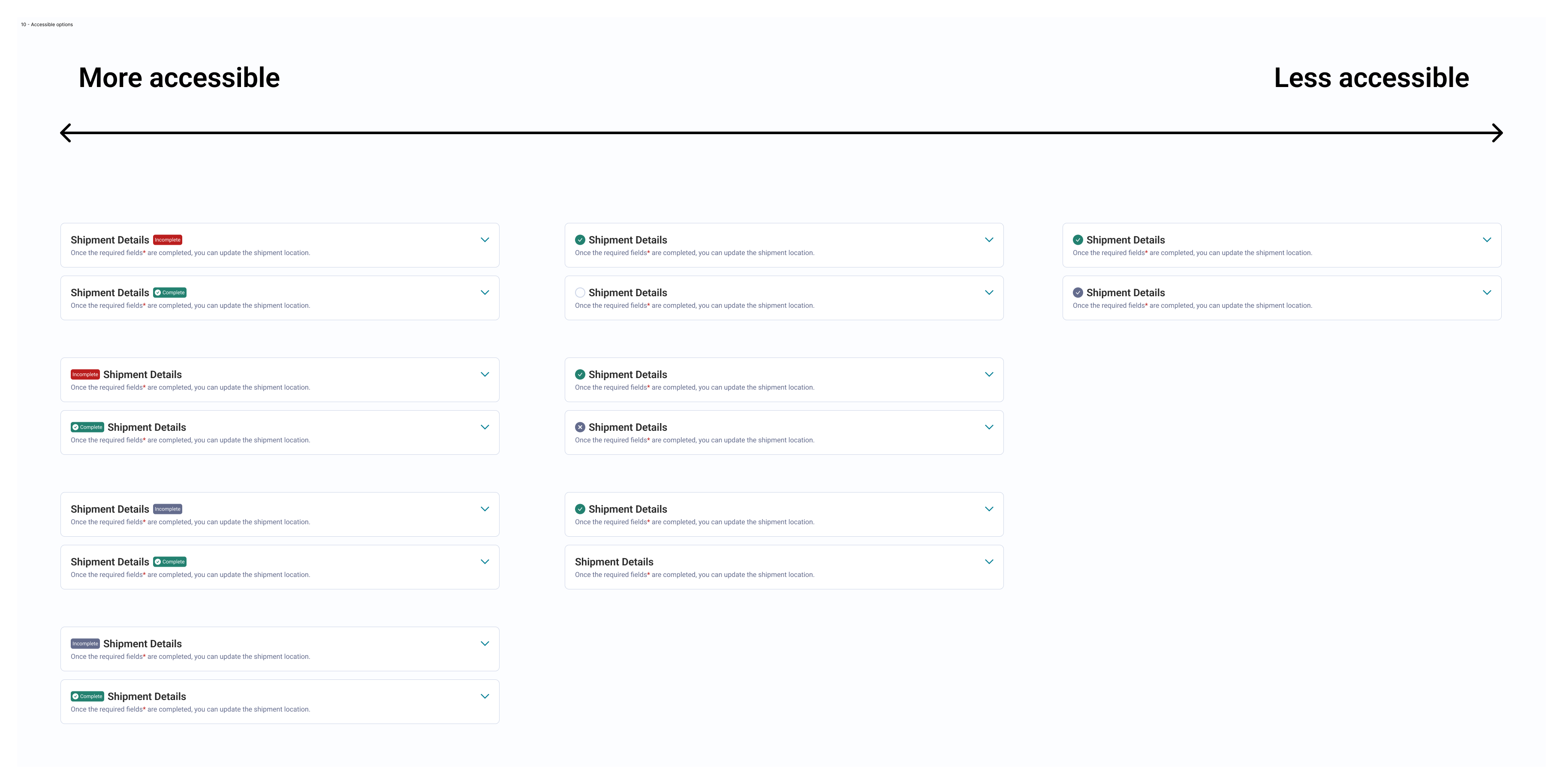
Additionally, we had to identify an accessible option to communicate when sections were being completed.
Finally, since the page was long, I wanted a way for users to navigate the page if they either made a mistake or changed their mind. I suggested a sticky anchor navigation section that followed the user as they traveled up and down the page. This would be more useful once we scaled and allowed page edits in the future.
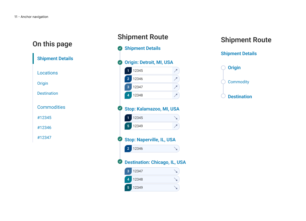
The pattern and components created during the initial scope have transcended this screen. They are our default treatment for groups of form fields and long pages. Over the year it has changed as scope increased, adding further complexity. While I don't have formal metrics comparing the two approaches, I've sat in on sessions with operations users completing this form and haven't seen anyone get stuck navigating the section logic.
If we had more time during the initial scope of this project I would have of course done some type of A/B user testing to verify if this was truly faster. I impressed myself by going forward and optimizing a solution that I didn't originally agree with. Looking back on it now, I still feel a wizard style approach would have been better, but I'm happy we ended up with a concept that reflects aspects of that design.