Feature
Tracking Shipments
Updating the UI and improving the UX for tracking in-transit shipments.
Updating the UI and improving the UX for tracking in-transit shipments.
Ascent leverages technology to improve the logistics process.

Users can't perform the task of tracking shipments in the new platform yet.

Validated solution was developed in the new platform and componentized in the design system.

Product Designer & UX Researcher

2 Business Analysts, and 1 Developer

Ideated and iterated ideas, ran usability testing and finalized design for handoff.
Ascent was in the process of launching a new B2B platform that carried all the features of their previous one. This feature was part of a prioritized list that provided users enough basic functionality to facilitate their day-to-day tasks. The biggest difference between the new and old platform was the inclusion of an interactive dashboard where users can customize "widgets" on the landing screen. While part of the project was updating the UI, the team sought out opportunities to improve the overall experience as well.
Let's imagine you're making a last minute purchase and need an overnight delivery. And it's always expected that an expedited delivery will cost more. Essentially, this is one of the ways Ascent makes their money, but instead of shipping a blender overnight, you are shipping a bunch of cars. The web facing product facilitates the logistics for this by tracking shipments. The user types, "Logistics," are the internal team who triage between our customers (large manufactures) and the delivery type (e.g. trucks, private jet). This is a high pressure transaction for everybody involved, and requires constant surveillance and communication.
In the previous platform, users monitor requests and transit updates on the landing page. This basic functionality did not exist in the new platform so users couldn't facilitate the most fundamental part of their job. Along with figuring out how to make this feature flexible and customizable, the biggest problem we needed to figure out was how might we communicate all datasets with little real estate available on the landing page.
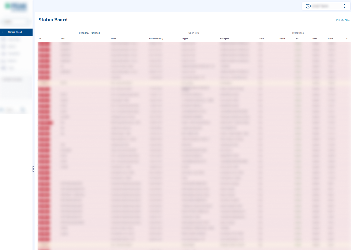
You know that feeling you get when there's already a solution in mind before you get started? So I wanted to see if there was any way at all we could explore solutions that weren't just a table. And well, I did. Unfortunately, for technical and business reasons we stuck with a table at the end of the day.
At Ascent I worked hi-fi immediately because it was easier for others to comprehend the solution and not get fixated on the UI. With the design system it was honestly a lot faster to work this way anyway.
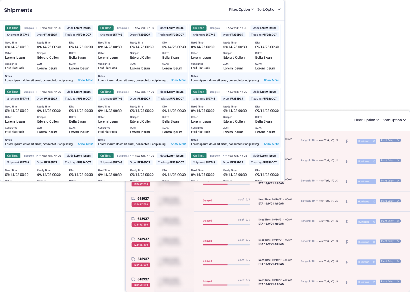
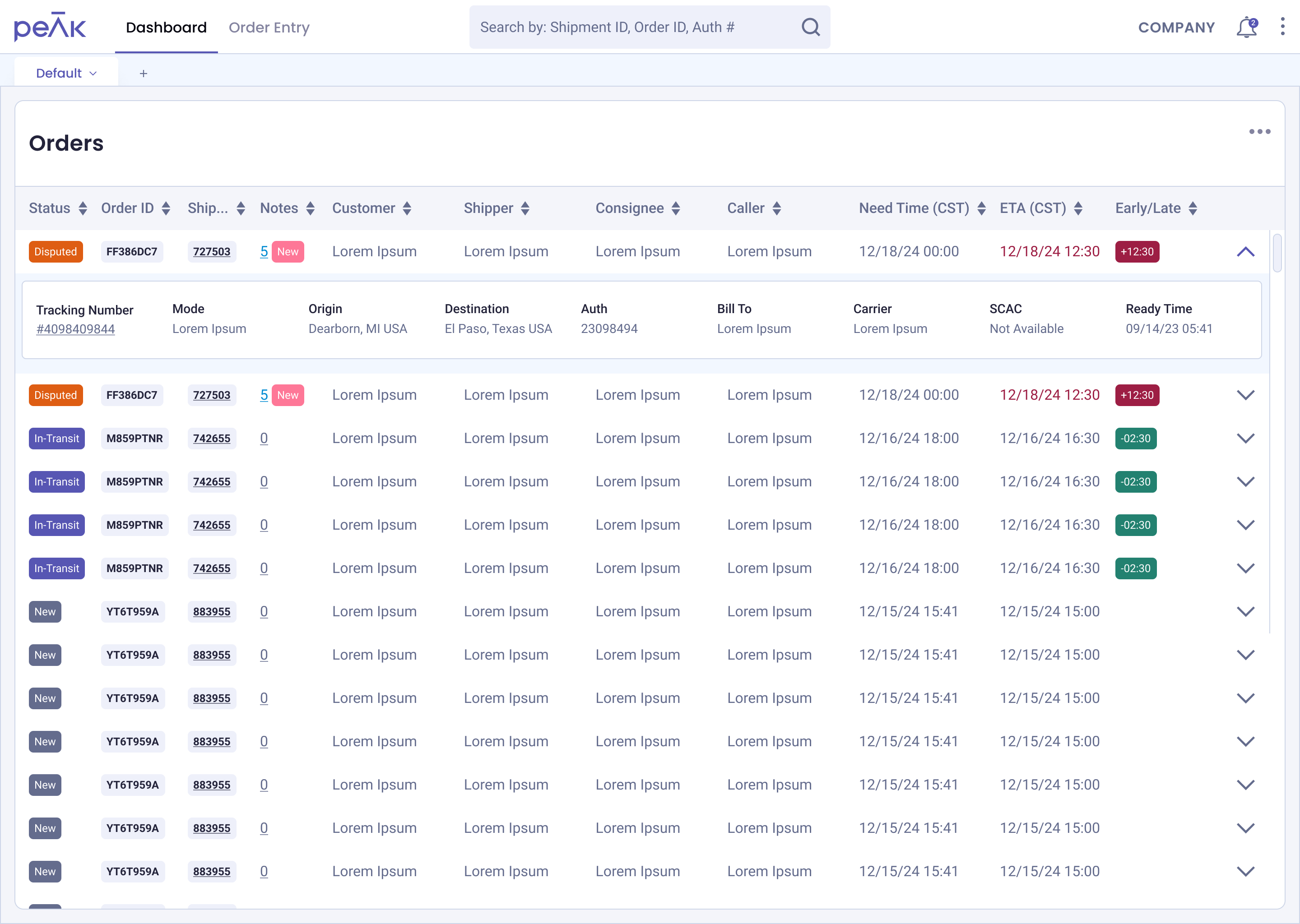
Ultimately, I did mock up a design with a table. The challenge with a table was how might we communicate up to 19 columns of data within a responsive table? Would users be okay with a horizontal scroll to look for information if we couldn't fit everything in one view?
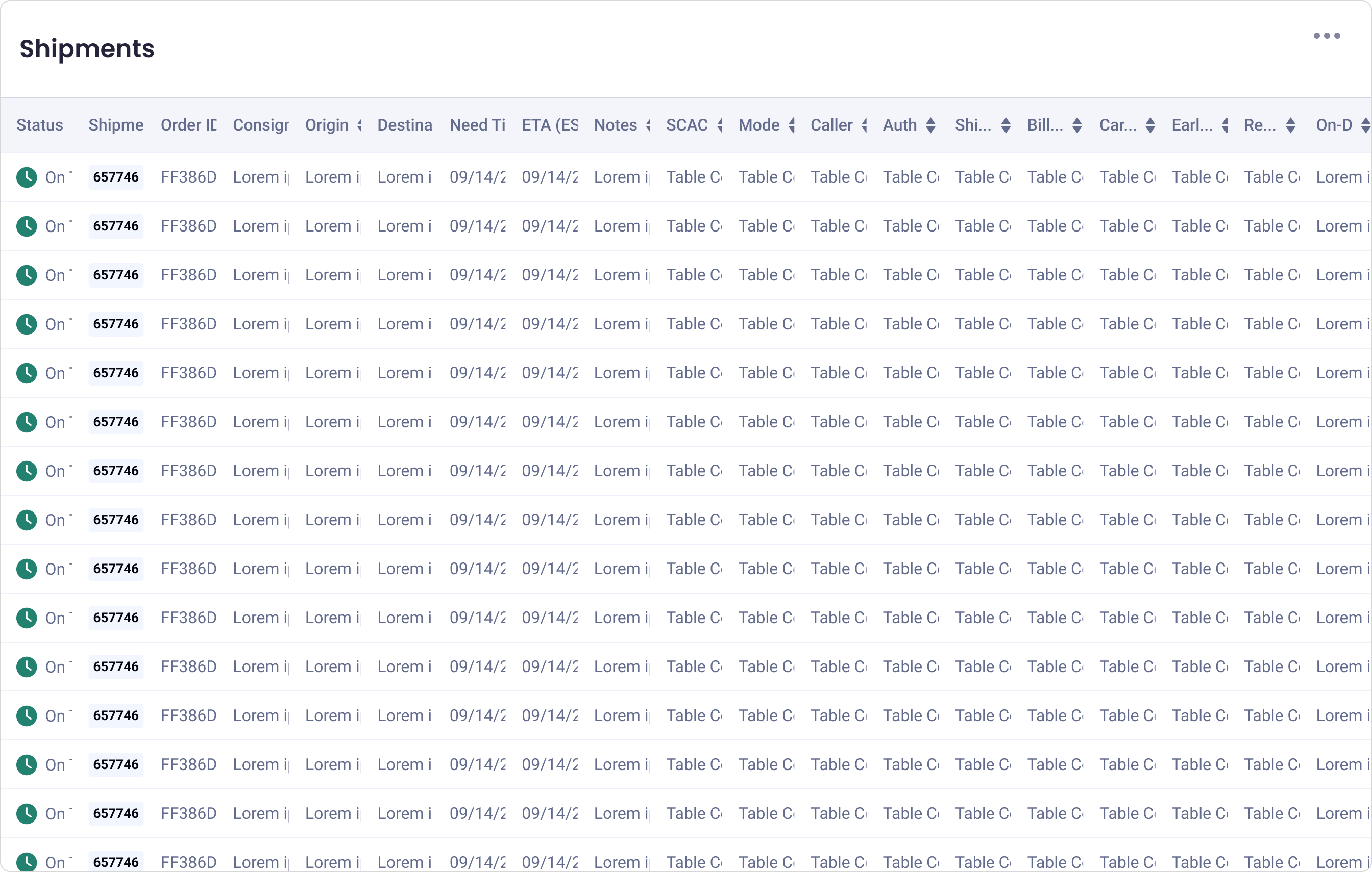
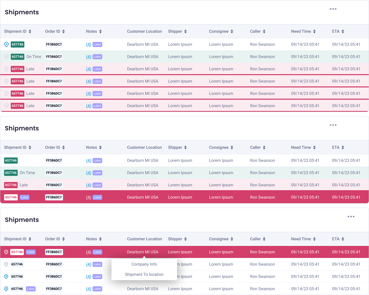
From previous projects I already knew this user group wanted to see as much data as possible without having additional interactions, and tables are one of the best ways to accomplish this. The problem with tables is cognitive overload. A cumulation of similar visuals can make it challenging to find the info you're looking for. When I'm working with tables I try to gauge what's priority. Are all the datasets equal weight priority or is there information more important than others? I start there to figure out how to establish a visual hierarchy. Hence, making some datasets more important than others.
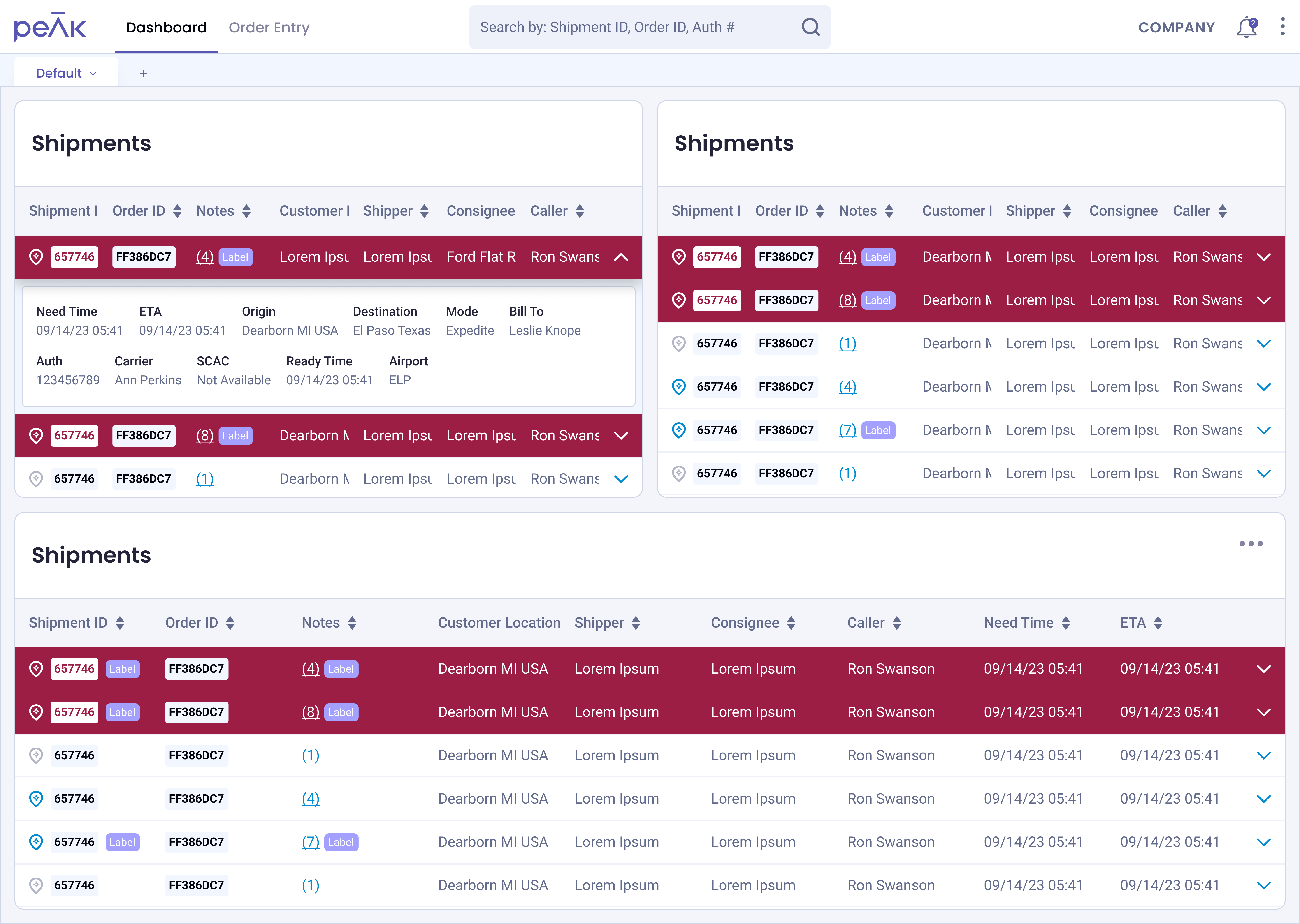
After we identified datasets that were "essential" vs. "nice-to-have," I decided to use a caret/accordion/collapse interaction to make the latter dataset accessible. This way we eliminate the use for a horizontal scroll, and users can see all the information they need without having to deal with cognitive overload.
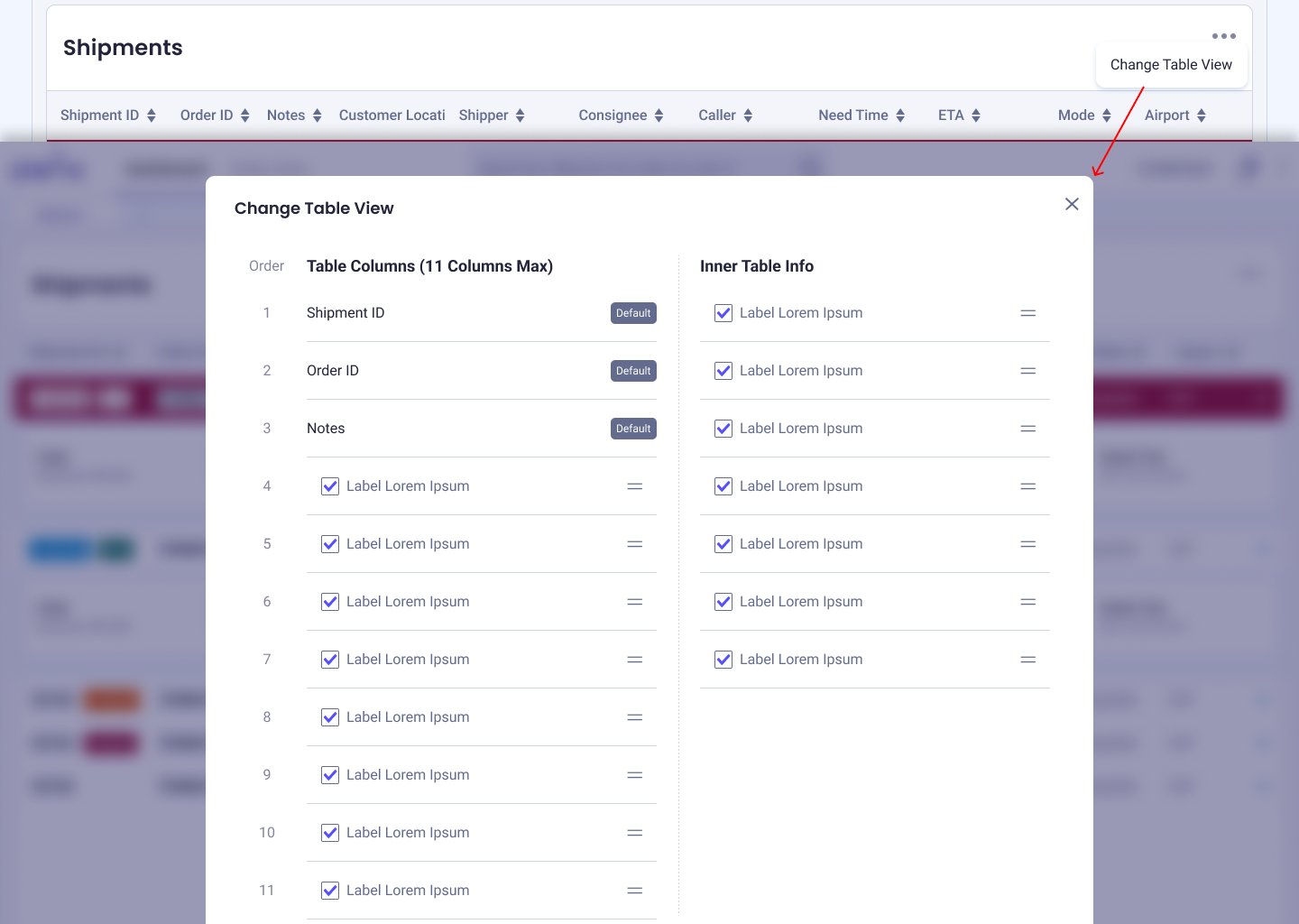
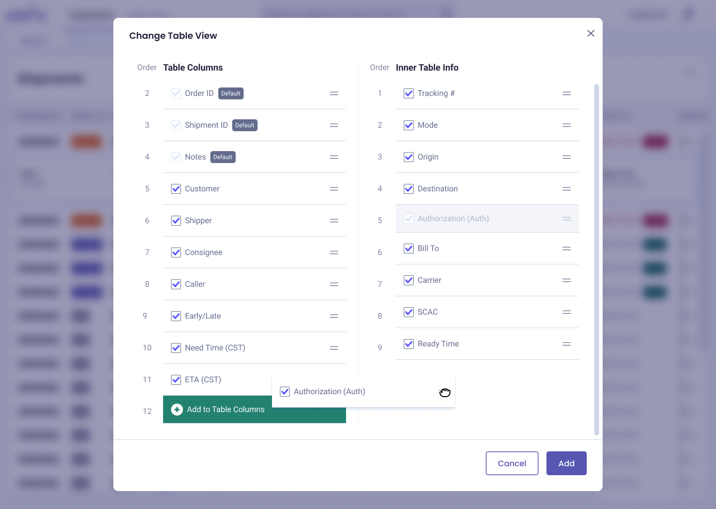
Finally, we needed to figure out how users can customize this data as every user type had different needs. I included a "see more" interaction where a modal pops up and a user can prioritize data within the table and the collapsed "inner table."
More specifically, my research questions were broken down to 2 categories: (1) can users recognize the data they need to facilitate their role, and (2) can users identify the intended affordances we've established in the design (e.g. can they identify a note? / do they know how to view a specific shipment?). So I created a prototype and ran a usability test with 8 users.
We learned that in the 10 tasks, most of the designs were validated. For the majority of the tasks we validated 8:8, sometimes 7:8, and the least successful ratio was 5:8.
In one of our findings, we learned that the way we labelled late shipments with the red background is helpful, but not as helpful during busy periods where most shipments are expected to be late. Additionally, since everything runs on priority, it was clear how late something was to another shipment. So we found a better solution where we labelled the "over/under" time in it's own column (to make it easier to sort). I advocated to not only rely on color to communicate meaning as that would not make this design accessible.
![What we tested during the usability test [above], and the design we ended up with for the final deliverable [bottom].](../images/shipment/shipment-testing.png)
With the development of this feature, we made the transition a little easier to the new system as we get closer to completely replacing the old one.
I've learned through this project and life in general that change is hard. Having users learn a new workflow can be a block to buying into a product. I feel like it takes understanding your stakeholders and users to have a sense of whether drastic change is warranted. With that said, this doesn't mean I will stray away from proposing a new paradigm (especially if the design reflects the best solution based on research), but I have a new perspective and understanding going into the next project. How much time do we have to complete this deliverable? Can we test? How open are stakeholders open to new design patterns? These are all things that I can identify and understand at the beginning of a project.