Capstone Project
Unemployment Registration
Researching use cases to improve the unemployment claims application.
Researching use cases to improve the unemployment claims application.
Redesign the entire IDES website for our capstone project at DePaul University.
Website not mobile responsive, unclear questions, information overload.
Rewrote scope, validated the UI application workflow prototype.
Project Manager, Lead UX Researcher.
2 Designers who co-led building wireframes, prototypes, and assets.
Monitor roadmap, facilitated tests and interviews, synthesized findings, wireframes and prototypes.
Users went to the Illinois Department of Employment Security’s (IDES) website to apply for benefits. The abnormal increase in applications brought to light issues on the website. Our team wanted to rectify some of these issues in our capstone project at DePaul University. Our original intent was to redesign the entire IDES website. Yet, 5 weeks in we refocused our scope, and redesigned the UI claim application only.
Users went to the Illinois Department of Employment Security’s (IDES) website to apply for benefits. The abnormal increase in applications brought to light issues on the website. Our team wanted to rectify some of these issues in our capstone project at DePaul University. Our original intent was to redesign the entire IDES website. Yet, 5 weeks in we refocused our scope, and redesigned the UI claim application only.
In this case study I'll focus on my immediate contribution. This includes our research methods, what we learned, and why we adjusted scope.
We created two guiding principles to give us constraints. This was important to us because we didn't have access to IDES employees. We wanted to approach this as if it were a client-facing project.
Our first guiding principle was to not make large systematic changes. This included changing the copy, the application requirements, and the design system.
Our second guiding principle was to seek out a diverse participation pool. This meant we had to reach out to participants who were true representations of our user. We had 43 out of 75 participants who were recently unemployed and completed a UI application. We did this through cold contacting people in our network and online. This includes Facebook/Reddit groups, and second/third degree friends.
In our discovery we wanted to learn about our users and identify usability issues on the site. The capstone requirements informed our research methods. During this phase we also redefined our project scope.
To learn about our users I facilitated interviews, surveys, and a literature review. Our goals were to identify their behavior, user journey, and key tasks. Also, I wanted to confirm if a mobile-design interface fit their use case.
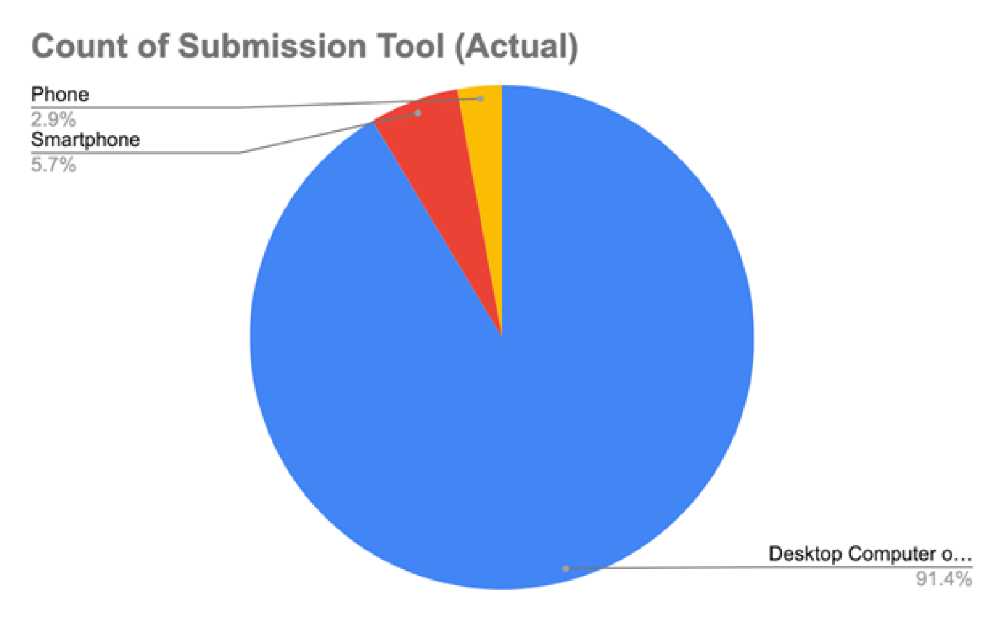
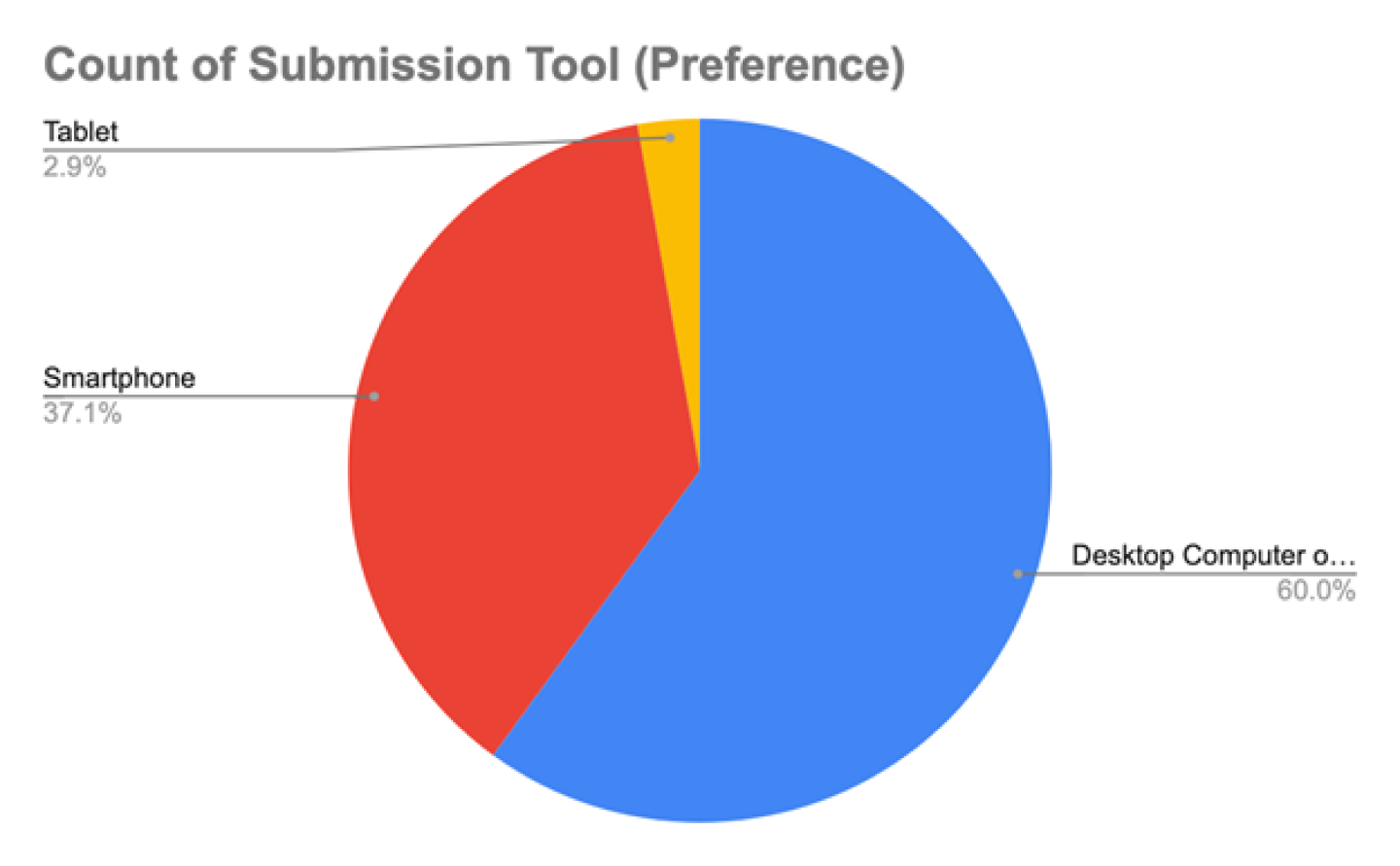
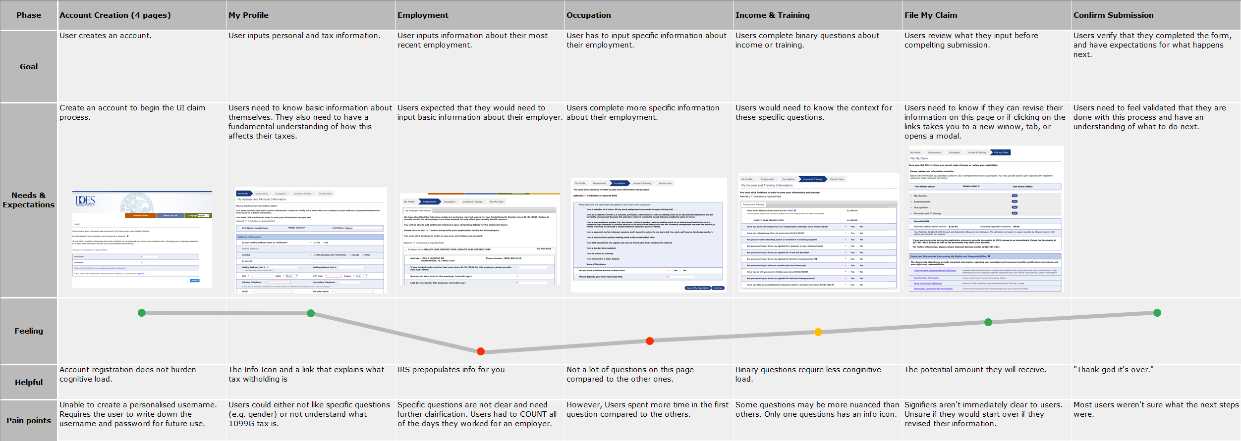
From our interviews and surveys, I learned about use case, and user behavior. Most users go to IDES to submit a UI claim, certifying a claim, and resources. They completed it on desktop, and not on their phones (figures 01 & 02, sample size is 35). I found that some users would go in-person for these tasks. Also, most users felt overwhelmed by the website (figure 03). From this research I identified their key tasks, and their problems with the site.
The literature review's purpose was to learn about the behavior of unemployed people. I was curious if there were existing frameworks. I learned that situational factors affected people's response to unemployment. However, there is enough evidence across different cross-sectional studies that supports the idea that “unemployed individuals had [a] lower well-being than employed individuals” [1]. As a result, we looked into ways on how we can put in place a “positive psychology perspective” [2]. This meant we would focus on crafting an experience that focuses on a user’s strength.
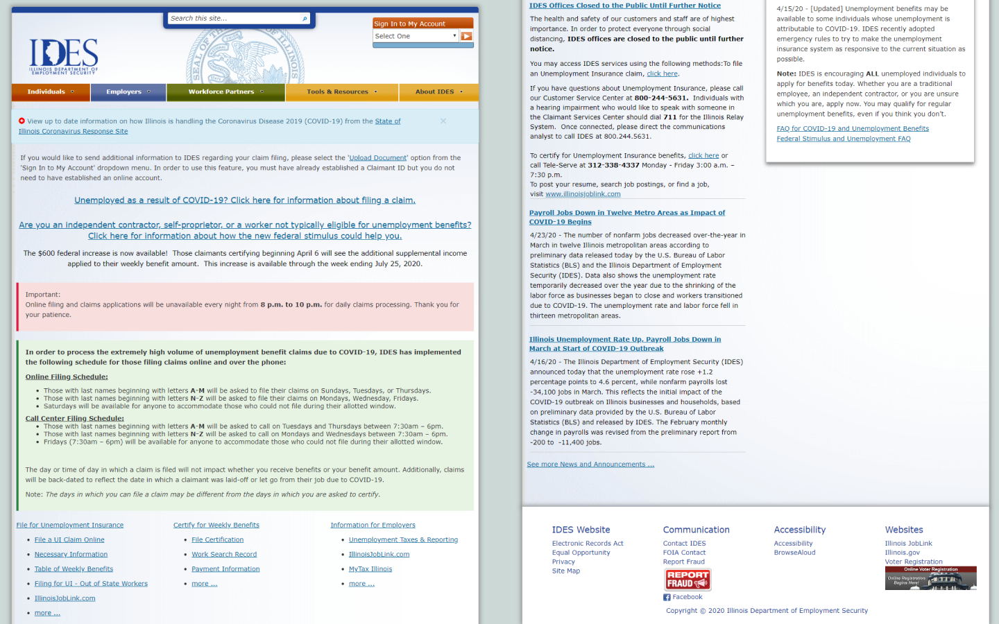
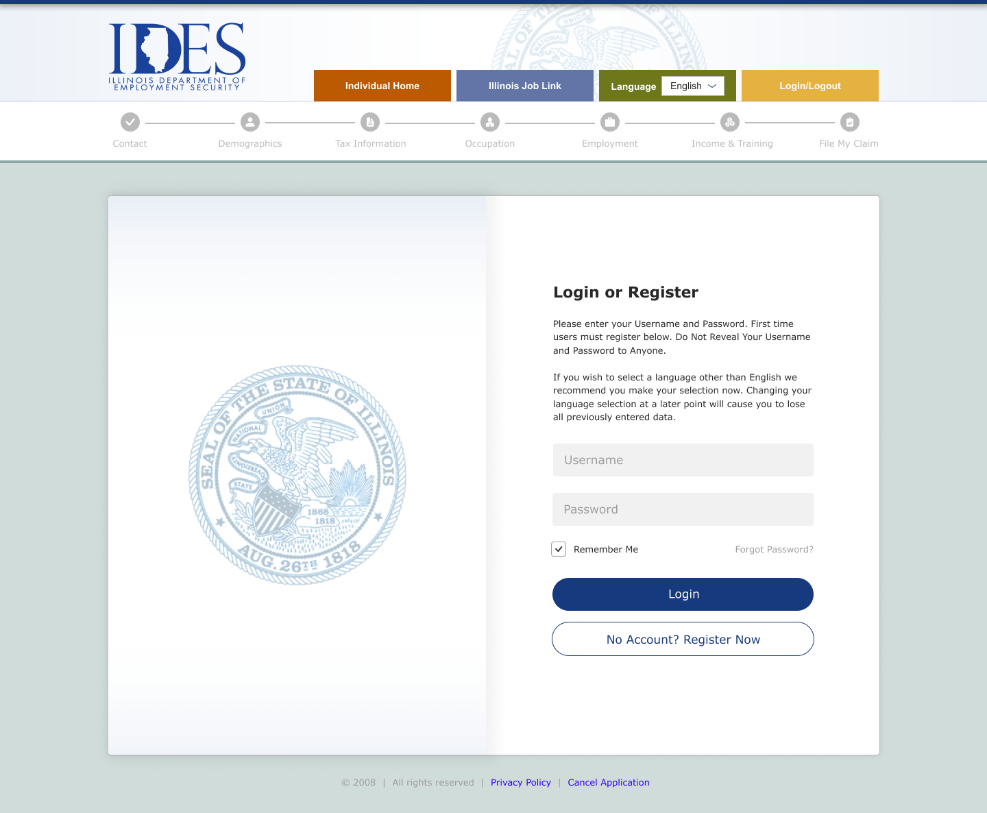
Besides user needs, we identified usability issues on the current site. We did this in a heuristic evaluation, and a usability test. Our primary goal was to identify pain points in the user journey.
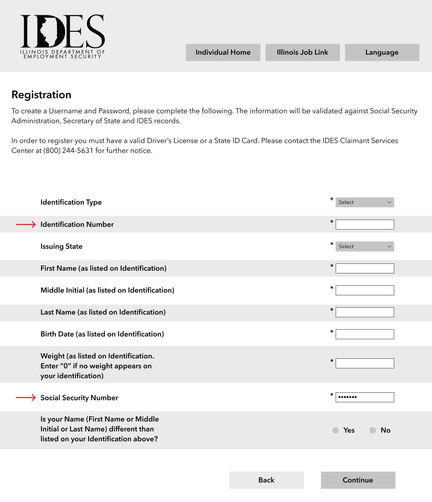
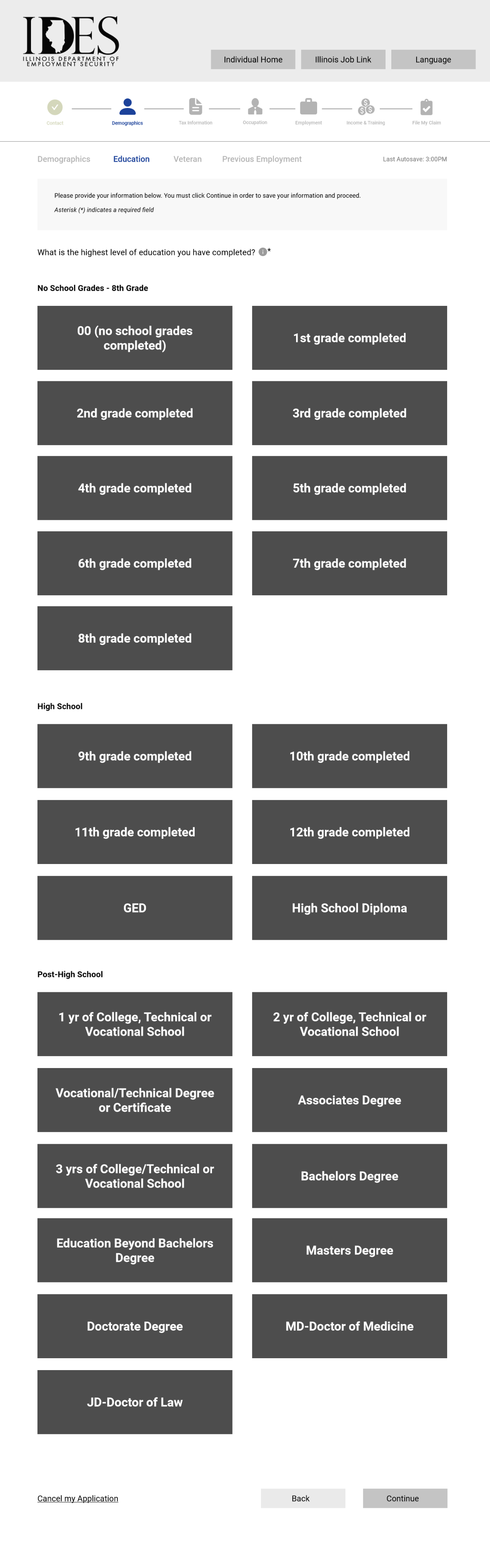
We developed our initial assumptions in our heuristic evaluation. Our biggest takeaways were error-prone forms, and unfamiliar language. There were no mechanisms for saving form fields. If users left the journey then they would have to start over. Also, there was a lot of language related to unemployment. If users were unfamiliar to these terms, you either had to Google them or search on the site.
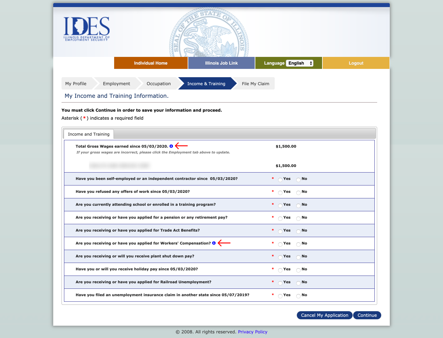
Also, we tested against our assumptions in the usability test of the current site. Our goal was to gather information for our user journey. Our biggest takeaways were needing further context (figure 05), and lack of automation (figure 06). From our all research methods we created our user journey (figure 07).
At the halfway point of 10 weeks, it was clear that we were not going to meet our project scope. Our original scope included redesigning 3 different tasks across 20+ pages. In less than 5 weeks we had to facilitate 2 rounds of usability tests, design high-fidelity wireframes, and submit a big report.
I knew it wasn't realistic.
So I had our team scale back. We focused on 1 task. We focused on the capstone requirements (usability tests). We shelved the nice-to-have's for later (high-fidelity wireframes). To do this I had to evaluate all the requirements we met so far, and projected how much time I thought we had left.
In summation, we went from designing the entire site to the UI claims application form. Focusing our efforts was a more effective use of our time and realistic within our time frame.
In both rounds of testing we had a total 9 participants who were recently unemployed and completed an unemployment application online.
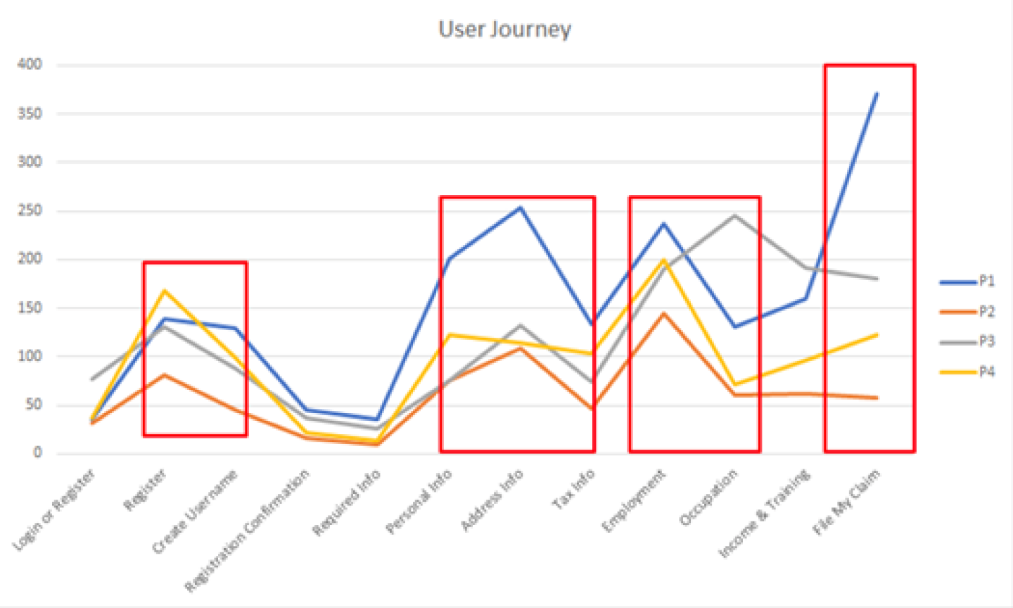
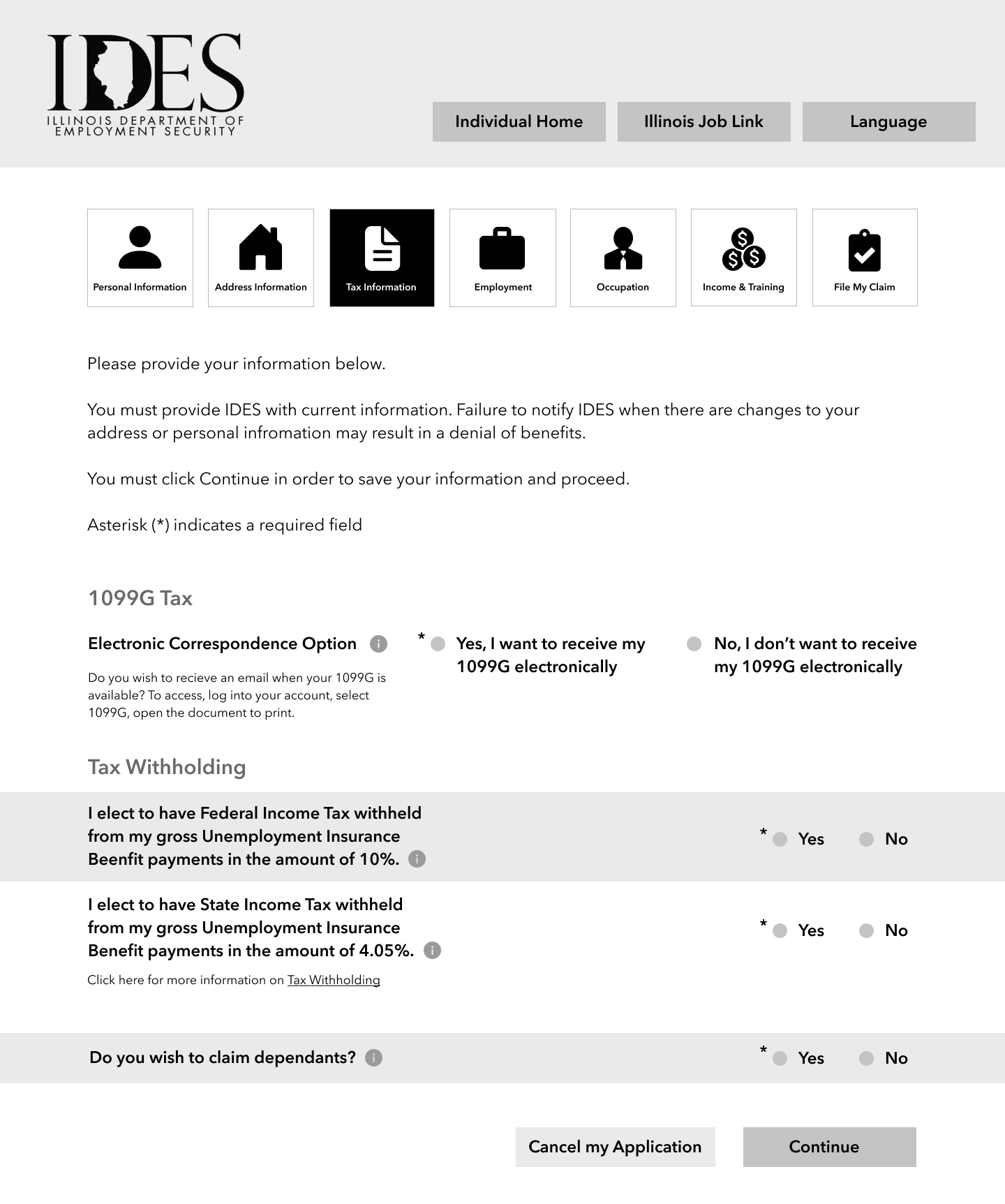
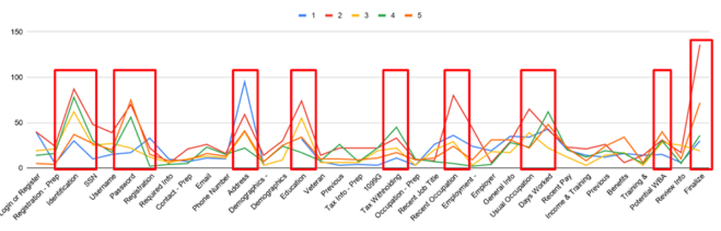
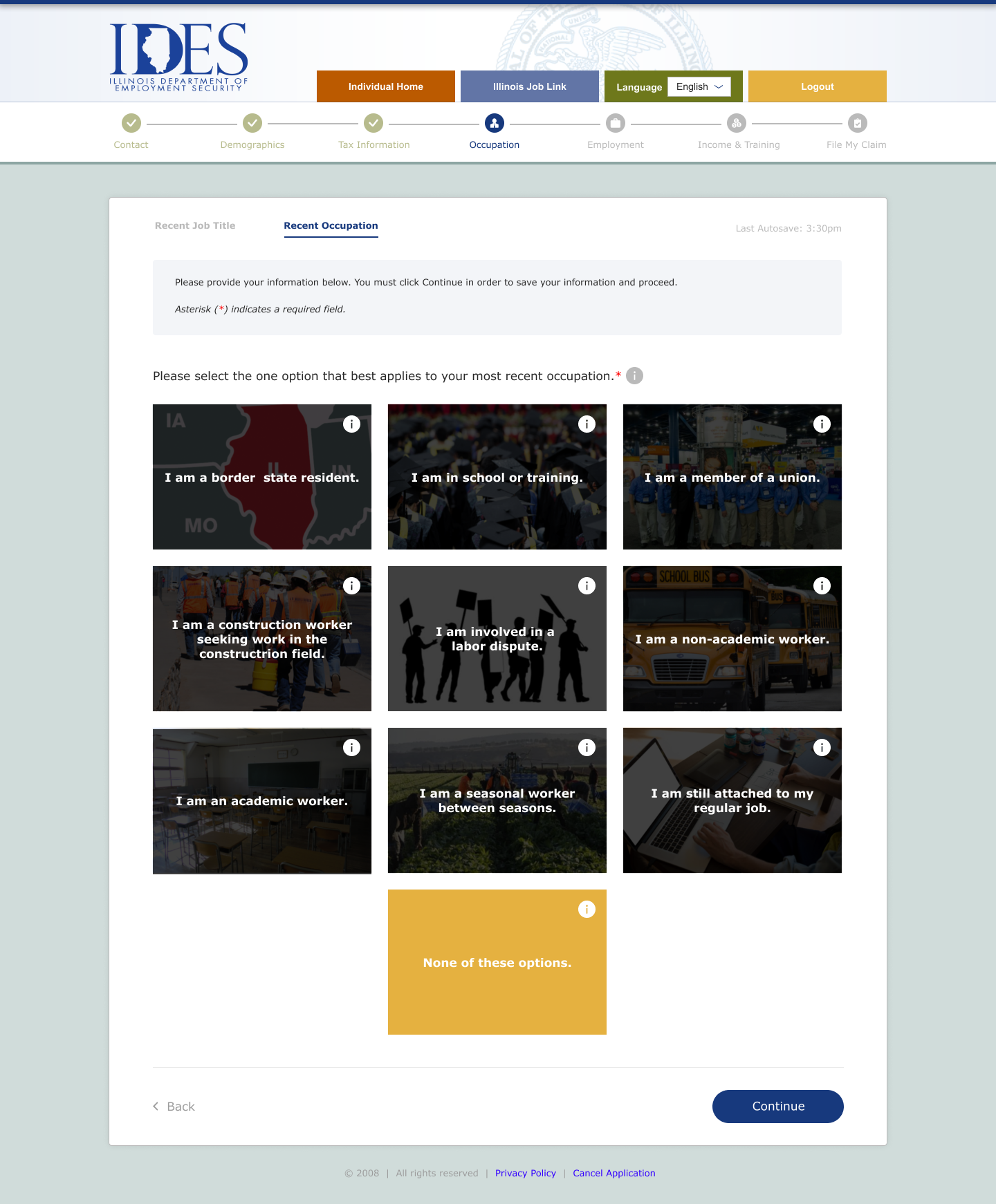
Our first batch of iterations focused on reducing cognitive load. We did this through breaking up sections into multiple pages so users can focus on a set of questions at a time. Our goal was to check and identify time spent on each page (figure 08), deep thinking questions, and usability issues.
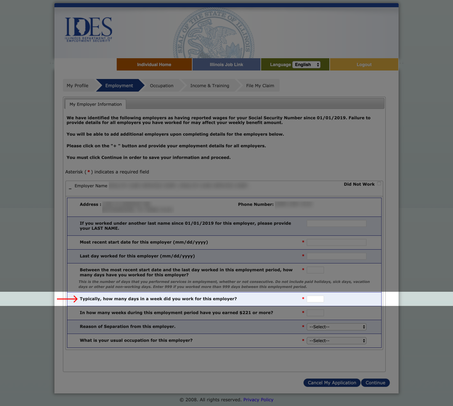
In our findings we identified why users spent more time on a page. Some answers required users to either prepare or search for it (figure 09). Others required further explanation (figure 10). Questions with multiple options increased cognitive load as well (figure 11).
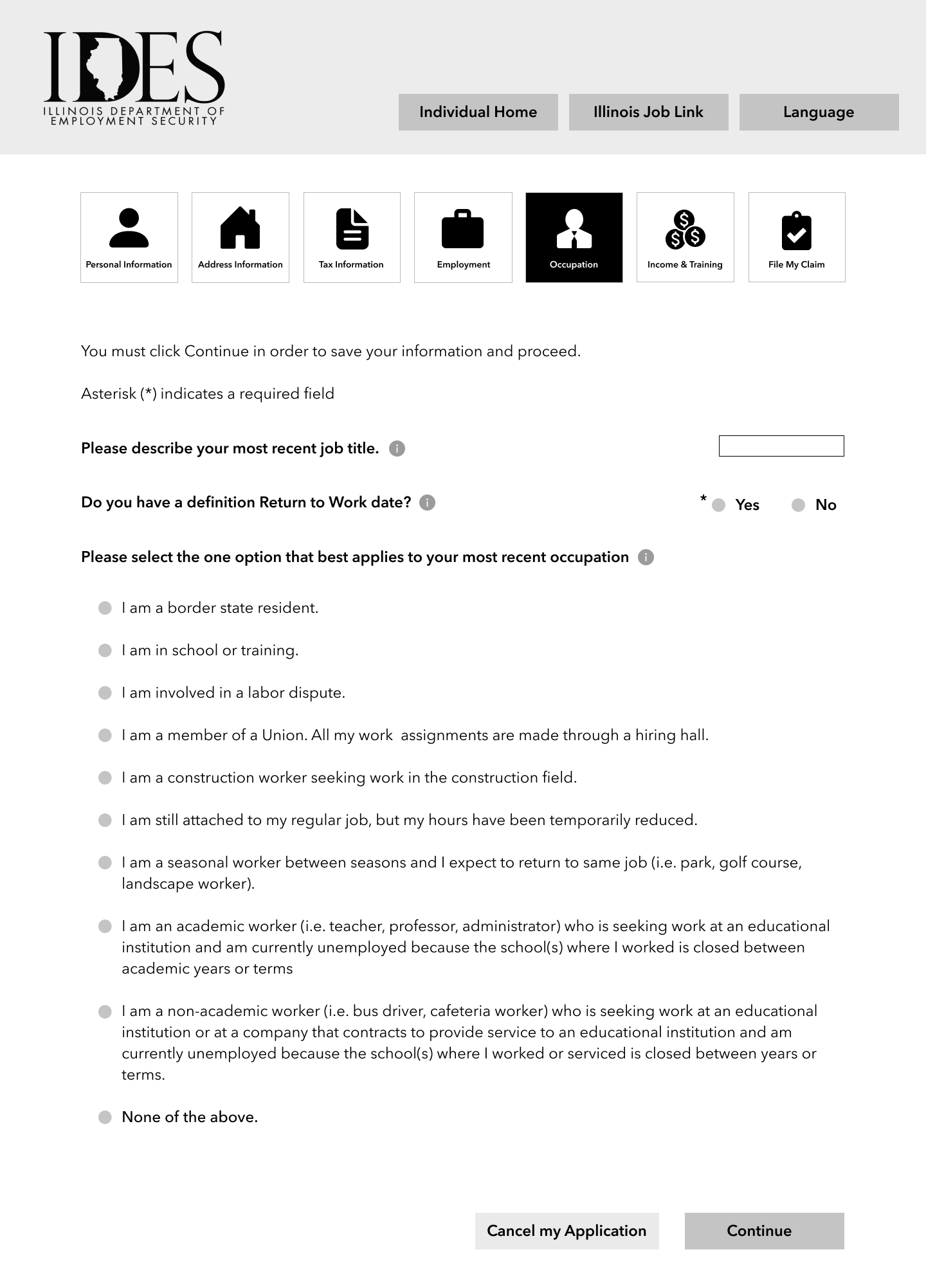
In our second batch of iterations we continued to focus on reducing cognitive load. This time we wanted to isolate questions that users spent more time on in the previous test. Our second usability liker to the first one. However, this time we added a Linkert scale to evaluate each page's ease of use (scale from 1 to 5, easy to hard).
This time around we had a better idea of which questions caused our users the most amount of grief. One idea we explored was the long drop-down menu. Since users searched for an answer, we wondered if there was another way to communicate this (figures 13 & 14)
If IDES was an actual client, I would suggest to include more context for the questions. In both rounds, users benefitted from this info icon. We hypothesized that IDES could decrease amount of call center calls if users could answer their own questions on the site.
After the project I mocked some UI concepts to show what our wireframes could look like (for fun). The challenge for these wireframes was to adhere to the design system as much as possible. This meant sticking to the color scheme, typeface, shadows. I borrowed from the main site since the actual UI application deviated quite a bit.

This was sort of already addressed, but it bears mentioning again that I learned a lot about scope. Planning 10-weeks ahead is difficult. There's so much that could have gone wrong in those 10-weeks. It was a balancing act between project requirements, and making time to meet user needs. I found it helpful to document our process throughout. This helped me determine how we're spending time, and if we're doing it effectively.
Additionally, I learned the importance of client collaboration. A client poses a different perspective from the production team. They highlight constraints and push-back for your ideas. These are elements that I find essential for optimizing creativity. In lieu of a client we followed our guiding principles and made assumptions. This was an okay proxy, but there's nothing quite like talking about your ideas out loud with someone else.
Also, I learned that software are tools. While Figma is my go-to tool for wireframing, it wasn't suited to test complex prototypes. Axure was a better use case for that. It helped me think more about our goals and identifying if our tools meets our needs.
For the curious there were other research methods I facilitated. I omitted them for the sake of the narrative. We did a competitive analysis to explore pro's and con's of unemployment websites. We also facilitated a card sort and treejack test (via Optimal Workshop). All methods were done when we were exploring the website's information architecture.
I've tried a couple routes to get this data to IDES but to no avail. If you or you know someone who works at IDES then please reach out to me. I would love nothing more than to give you our research for free!!
[1] McKee-Ryan, F. M., Song, Z., Wanberg, C. R., & Kinicki, A. J. (2005). Psychological and Physical Well-Being During Unemployment: A Meta-Analytic Study. Journal of Applied Psychology, 90(1), 53-76. https://doi.org/10.1037/0021-9010.90.1.53
[2] Synard, J., & Gazzola, N. (2019). Moving towards positive well-being in the face of adversity: What explains individual variations in well-being following job loss? International Journal for the Advancement of Counselling, 2019. [https://doi.org/10.1007/s10447-018-9359-6](https://doi.org/10.1007/s10447-018-9359-6)